Google Discontinues Free Websites Starting in March 2024!

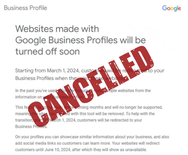
In a surprising turn of events, Google has announced its decision to discontinue its free website offerings, a staple for many small businesses and individuals looking to establish an online presence without initial investment. This move signals a broader industry trend emphasizing the importance of quality, SEO, and website performance—elements often lacking in free web solutions. As the digital landscape evolves, the necessity for businesses to invest in professional, reliable website services has never been clearer. Sign Company Websites has been here for over 15 years as a beacon for those seeking affordability without compromising on these critical aspects, proving that a quick setup and professional online presence are within reach.

The Drawbacks of Free Websites

Historically, free websites offered a no-cost entry point for businesses to go online. However, this seemingly advantageous starting point comes with its fair share of limitations. Customization options are typically minimal, leaving businesses with generic, unremarkable websites that fail to stand out or truly reflect their brand identity. More importantly, free websites offer limited SEO capabilities, making it challenging to rank well on search engines like Google. In an era where online visibility is paramount, these shortcomings can significantly hinder a business’s ability to attract and retain customers.

Moreover, free websites often suffer from poor performance metrics, such as slow loading times and lackluster mobile responsiveness. With user experience as a key ranking factor for search engines, these issues not only affect a site’s SEO performance but also its ability to engage visitors effectively. The cumulative effect of these limitations can be detrimental to a business’s online growth and reputation.

Sign Company Websites Designed by a Sign Company Owner!

The Evolution of SEO and Performance Standards

Search Engine Optimization (SEO) and website performance standards have evolved dramatically over the years. Google’s algorithms now prioritize websites that offer mobile optimization, and high-quality relevant content. These criteria are designed to enhance the user experience, rewarding websites that meet these standards with higher search rankings and increased visibility.

This evolution underscores the importance of having a website that can adapt and comply with the latest SEO practices and performance benchmarks. Free website solutions, with their inherent restrictions, often fall short of these requirements, leaving businesses at a disadvantage in a competitive digital marketplace.

Sign Company Websites: The Optimal Solution

Recognizing the limitations of free websites and the necessity for businesses to adapt to the evolving demands of the internet, Sign Company Websites offers a compelling alternative. Our services are tailored to meet the needs of modern businesses, providing affordable, high-quality websites that don’t sacrifice performance for price.

Turn-key Website

We have streamlined the process for our website builds making is faster and more affordable. Designed by our founder, and former sign company owner; we include everything needed to get you up and running. Images, content, galleries, forms… EVERYTHING

Customizable Designs for Brand Identity

Sign Company Websites understand the importance of a unique online identity. Unlike free websites, our solutions offer a wide range of customization options, allowing businesses to create a website that truly reflects their brand and resonates with their target audience.

Affordable and Fast Setup

Our commitment to affordability and efficiency means that businesses can have their website up and running quickly, without breaking the bank. Sign Company Websites offers a variety of packages designed to fit different needs and budgets, ensuring that every business can find a solution that works for them.

Get a Professional Sign Company Website Today!

Google’s decision to discontinue free websites is a clear indication of the shifting priorities in the digital world. Quality, SEO, and performance have become non-negotiable elements for businesses looking to succeed online. In this new era, Sign Company Websites stands out as the perfect partner for businesses seeking to navigate these changes effectively. With our customizable, SEO-ready, and performance-optimized website solutions, businesses can achieve a competitive edge online, ensuring their growth and success in the digital marketplace.

Create a Call to Action for Your Sign Company Website

Create a Call to Action to get your sign customers to DO something!To create an effective marketing plan for your sign company or sign shop you will need to have a powerful and enticing “Call to Action”. A Call to Action is some form of clear request by you to your visitor (potentially new sign customer) to DO something. Whether it’s filling out a quote request form for a new sign or vehicle wrap, calling you today to begin a conversation about a sign, signing up for your service or services, watching a short online commercial about your sign company, or purchasing one of your many sign products. Most successful sales processes consist of 1 or 2 and even multiple steps, each of which contain “one” Call to Action.

You need to tell your potential sign customer what they need to do because most people are searching for help or for products because they’re out of their area of expertise. They’re usually uncertain about the steps or processes involved in buying a sign or gettign a vehicle wrap so a quick internet search is usually the first step. By giving them a clear “Next Step” you’re helping them to move forward more quickly and more confidently.

It’s VERY important that the Call to Action is a compelling suggestion or request. For example if you are selling a monthly service through a subscription, you can say something like: “Sign up today and get TWO months FREE!” or “Get a FREE month of service when you prepay for the year!

You should also set a deadline or expiration date on your offer to create a sense of urgency and make them “act now” instead of putting it off. Of course you will need to update your page when it’s time to change the expiration date and offer a different deal. We recommend you plan a series of Call to Actions for a few months in advance, maybe quartlery.


Here are some ideas you might want to consider for your call to action:

General Call to Action Ideas

Click HERE for more info
Free Estimate! Click HERE
Free Shipping
CLICK ME NOW!
Make The Switch!
Register Today
ACT NOW
Contact Us Today!
Get FREE Access
Create my Account
Enroll Now
Apply Now
Request a Visit
Need Info?
Request Information
Follow Us!
Watch a Guided Video HERE
See For Yourself!
Learn More!
Save Now
Follow us on YouTube
Follow us on Twitter
Like us on Facebook
Check It Out!
Find Out How!
Read It Here!
Join the Team!
Become a Member!
Sign up for Free
Download
Upload your files here!
1st Month Free!
Watch Video
Watch Demo
Click to Look Inside
Buy It Now (online)
Quick Checkout
Add to cart
Buy Now!
Helpful Tips – Click HERE
Sign Up for our FREE Monthly Newsletter
Subscribe to our Blog
Listen to our Podcast
Confirm my Subscription
Request a free quote today!
Get Instant Access
Register Now for a FREE Seminar
Register Now for a FREE Webinar
FREE In Home Design Consultant
Limited Time Offer
Call Today to Schedule your FREE inspection!
100% Guaranteed! Click HERE!
Limited time offer, some restrictions apply
Get Started Now (it’s free)
Click here for our Virtual Tour
Try It FREE (Free 30 day trial)
See How We Can Optimize Your Business
TRY IT FOR FREE! Get started in seconds
Click Here For Your FREE Gift

We thought we would provide some ideas for those industries, so take a look below,
they might spark an idea you could use for your sign business!

Sign Company & Printing Company Example Call to Actions:

1000 Full Color Business Cards for only $49 or 5,000 for $125
(includes Double sided, full color printing with Gloss front on UV coated stock, does not include graphic design/layout, see sales associate for details)

3’x5’ Full Color Banner (Hems and Grommets included) for only $80
(Some restriction apply, see sales associate for details)

Free Shipping on orders over $75
(Offer valid on online orders only, some restriction apply, cannot be combine with any other offer or past order)

Save 20% and get Free Shipping on any new order of $200 or more
(Use Promo Code: 0123, some restrictions apply, cannot be combine with any other offer, see sales associate for details)

3 Months Free Hosting with the purchase of a Website
(Website includes 6 fully loaded pages, Pre-filled Content, CMS (Content Management System) allowing you to edit your own website anywhere, anytime, tutorial videos to help you along the way and many Website Themes to choose from. No software installation needed! Some restrictions apply. See your sales representative for more information).


Feel free to shoot us an email and ask our advice on your Call to Action, we’d love to help!

A Good Sign Design vs A Bad Sign Design

There are many factors to consider when designing a sign. Many sign designers simply put text in, set the font, set the colors, walk away from it and consider it done. Sometimes they do this because of time constraints, sometimes they do this because they just don’t know any better or they’ve never considered any other way. However, it will cost you if you allow this kind of thinking and working to become part of your normal design routine. If you ignore some of the important rules of design, you will not see as great of a return business and your competitor will grow while you continue to struggle to stay in business. Yes, design is THAT important! If you have an effective design, your sign will be effective, resulting in your customers business bringing in more money, resulting in you having repeat business. If your design is ineffective, you will never hear from the customer again and never know why.

A wise sign designer will strongly consider all of the important aspects of proper sign or advertisement design because they want their sign to be effective for their customer so their customer can grow their business. This is important not only because of repeat business that their customer will bring, but more importantly referrals thanks to an effective sign design and a successful long term business relationship that resulted from a job well done.

Below are two examples of good designs and two examples of bad designs. We’ve provided examples for both one color and full color, depending on your customer’s budget. Below each example you will find a list of reasons why each design is either effective or ineffective.

A Good Sign Design vs A Bad Sign Design:
(Simple 1 Color Sign Design)

Poorly Designed One Color Sign:

Sign Company Websites Blog - Advice - A Good Sign Design vs A Bad Sign Design

Well Designed One Color Sign:

Sign Company Websites Blog - Advice - A Good Sign Design vs A Bad Sign Design

Reasons this is a Bad Sign Design:

  • The top and bottom lines are using fonts that are difficult to read from a distance. A customer should never have to struggle (even a little bit) to read a sign, it should be easy to read at a glance! 
  • All of the fonts used here are too thin. Sign fonts should almost always be bold because a bold font can be seen from a greater distance as well as grabbing attention more effectively.
  • There isn’t any contrasting sections, it’s just three lines of text.

Reasons this is a Good Sign Design:

  • All the fonts used here are easy to read because they’re bold, simple and do not have serifs. The more simple a font is, the easier it is to read from a distance. to prove this point, simply stand really far back from the or screen and see for yourself. 
  • There are geometrical shapes that will grab a customer’s attention because it’s not just text there are some shapes involved. There are also slight curves to the lettering bringing more character and attention to the lettering.
  • The top 1/3 of the sign has been reversed out which causes a substantial amount of contrast from one part of the sign to the next and this will grab the attention of your customer so much more effective than everything having the same background color.
  • There was consideration taken for the most important words on the sign. “50% OFF” is the first thing you read because it’s the biggest and boldest which is what your customer will see if they only have a split second to look at the sign.

Sign Company Websites Blog - Advice - A Good Sign Design vs A Bad Sign Design

A Good Sign Design vs A Bad Sign Design:
(Full Color Sign Design)


Poorly Designed Full Color Sign:

Sign Company Websites Blog - Advice - A Good Full Color Sign Design vs A Bad Full Color Sign Design

Well Designed Full Color Sign:

Sign Company Websites Blog - Advice - A Good Full Color Sign Design vs A Bad Full Color Sign Design

Reasons this is a Bad Sign Design:

  • The words are difficult to read because of the complicated font choice. You should always use simple fonts, especially when using a gradient or variable background.
  • The top line’s drop shadow causes the line to be almost impossible to read because it’s so busy.
  • There is not enough contrast between the letters in the background making the sign almost unreadable at a certain distance and therefore useless.
  • The bottom line actually messes with your eyes because blue letters on a red or orange background will only blur together visually.

Reasons this is a Good Sign Design:

  • All the fonts used here are bold and effective because they’re easy to read at a distance and they stand out well on the background.
  • There is a stark contrast between the black curved bar at the top and the gradient background it sits on making the sign an extremely effective eye grabber as people either walk or drive by.
  • All of the letters have correct contrast between its background thanks to outlines and drop shadows effectively placed.
  • It’s a well-balanced design with respect to color because it uses the right colors right places.
  • There are it is actual depth in this design because of the effective use of natural drop shadows and a metal bevel effect causing the letters to look 3-D.

Again stand back from your screen and look at these from a distance as your customer will be. Also look away from the screen and glance at it for 1 to 2 seconds and think about what you saw in which one was more effective. This is why we placed them side by side.

 Here are some important criteria every sign you design should meet:

  • Can your sign’s main message be easily read and understood from a distance?
  • Can your sign’s main message be easily read and understood at a glance?
  • Are you using bold fonts?
  • Is there enough contrast between the background and the lettering?
  • Is your sign too busy? Does it have to much information on it, or too many photos/graphics?

Sign Company Websites Blog - Advice - A Good Sign Design vs A Bad Sign Design